
CONTEXT
In 2021, Indeed's product ecosystem was fragmented across 2,000+ repositories with inconsistent experiences serving 250M+ global users. Teams were duplicating work, brand expression was inconsistent, and engineering velocity was hampered by technical debt.
NORTH STAR VISION
"A unified design system that enables teams to ship quality experiences 10x faster while maintaining Indeed's trusted brand across every touchpoint."
NORTH STAR PILLARS
Adoption First
Build system components teams actually need, not what we think they need
Quality as Default
Make the right thing the easy thing through excellent DX
Measurable Impact
Track metrics that matter to business outcomes
Scale Through People
Grow capability across org, not just within DS team
SHIPPED OUTCOMES
Adoption Metrics
94% design system adoption across 2,000+ repositories
Grew from 43% to 94% adoption in 18 months through strategic rollout
100% of new projects started with system components
Efficiency Gains
6.8x UX efficiency improvement. Design-to-deployment time from 3-4 weeks to 3-5 days
2.8x engineering velocity. Component implementation reduced dev time by 65%
$4.2M estimated annual savings in avoided duplicate work and reduced work cycles
Quality Improvements
WCAG 2.1 AA compliance achieved across all components
40% reduction in cross-browser/device bugs
87% designer satisfaction score (vs 34% before the project started)
STRATEGY
Phase 1: Foundation
Audited existing patterns across all products to identify commonalities
Built pilot component library with top 15 most-used patterns
Established design tokens for color, typography, spacing, elevation
Created proof-of-concept with 3 high-visibility product teams
Phase 2: Scale
Rolled out system to 500+ product teams through quarterly waves
Built comprehensive documentation hub
Established office house, Slack channels, and embedded support model
Created automated migration tools for legacy component
Phase 3: Maturity
Expanded system to cover 200+ components and 50+ patterns
Integrated accessibility testing into CI/CD pipeline
Built component analytics to track usage and identify gaps
Established contribution model
BUSINESS IMPACT
Enabled 3 major product launches to ship 40% faster than historical average
Reduced design QA cycles from 2 weeks to 2 days
Decreased customer-reported UI inconsistency issues by 78%
Supported Indeed's rebrand rollout across all touch points in 6 months
LEADERSHIP APPROACH
Led cross-functional team of 25+ consisting of UX designers, UX engineers, content designers, and researchers
Presented monthly business reviews reporting on design system impact to executive leadership
Championed system adoption through storytelling with data
Built coalition across product, ux, engineering, brand, and accessibility teams
KEY OBJECTIVES COMPLETED
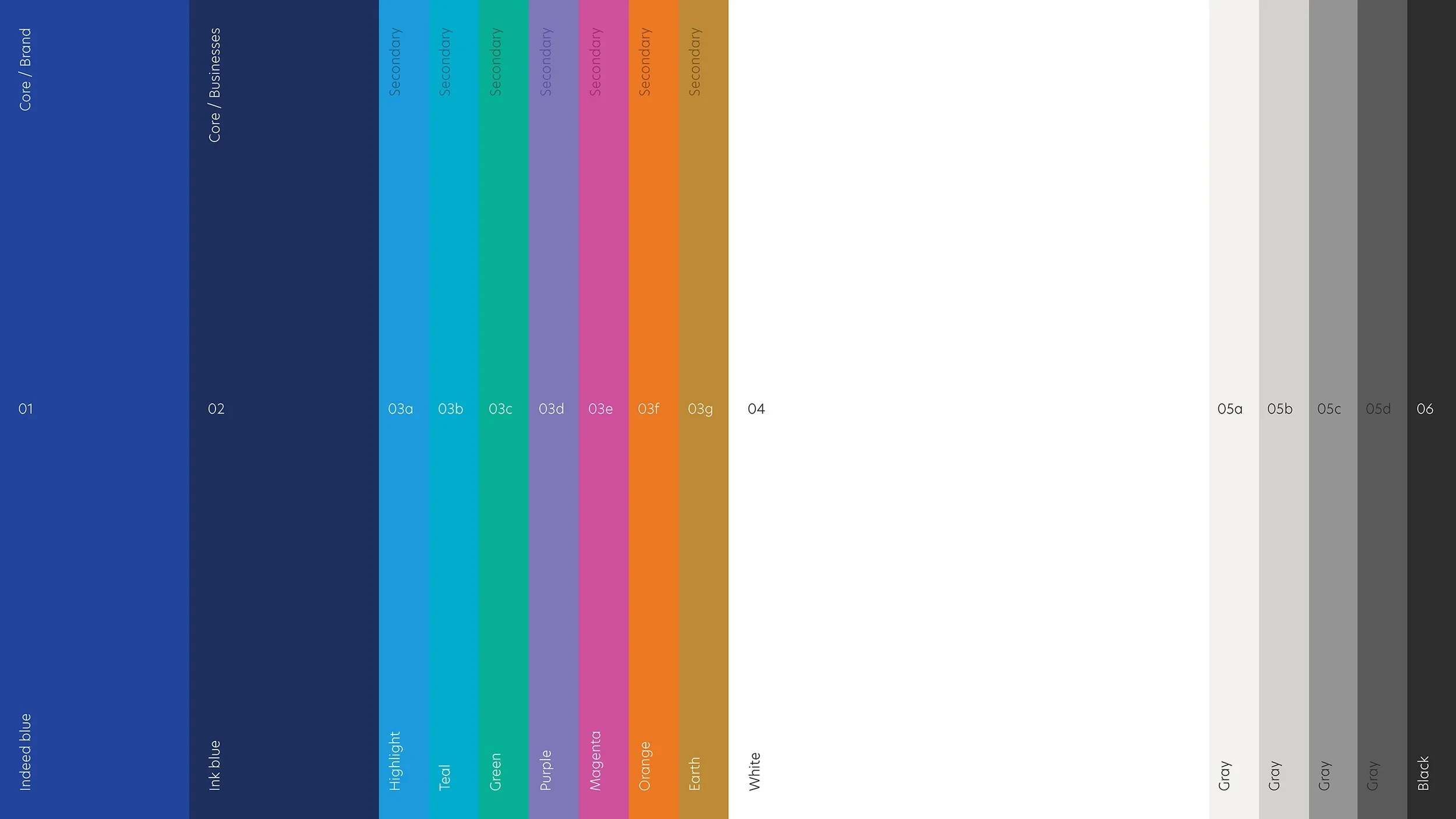
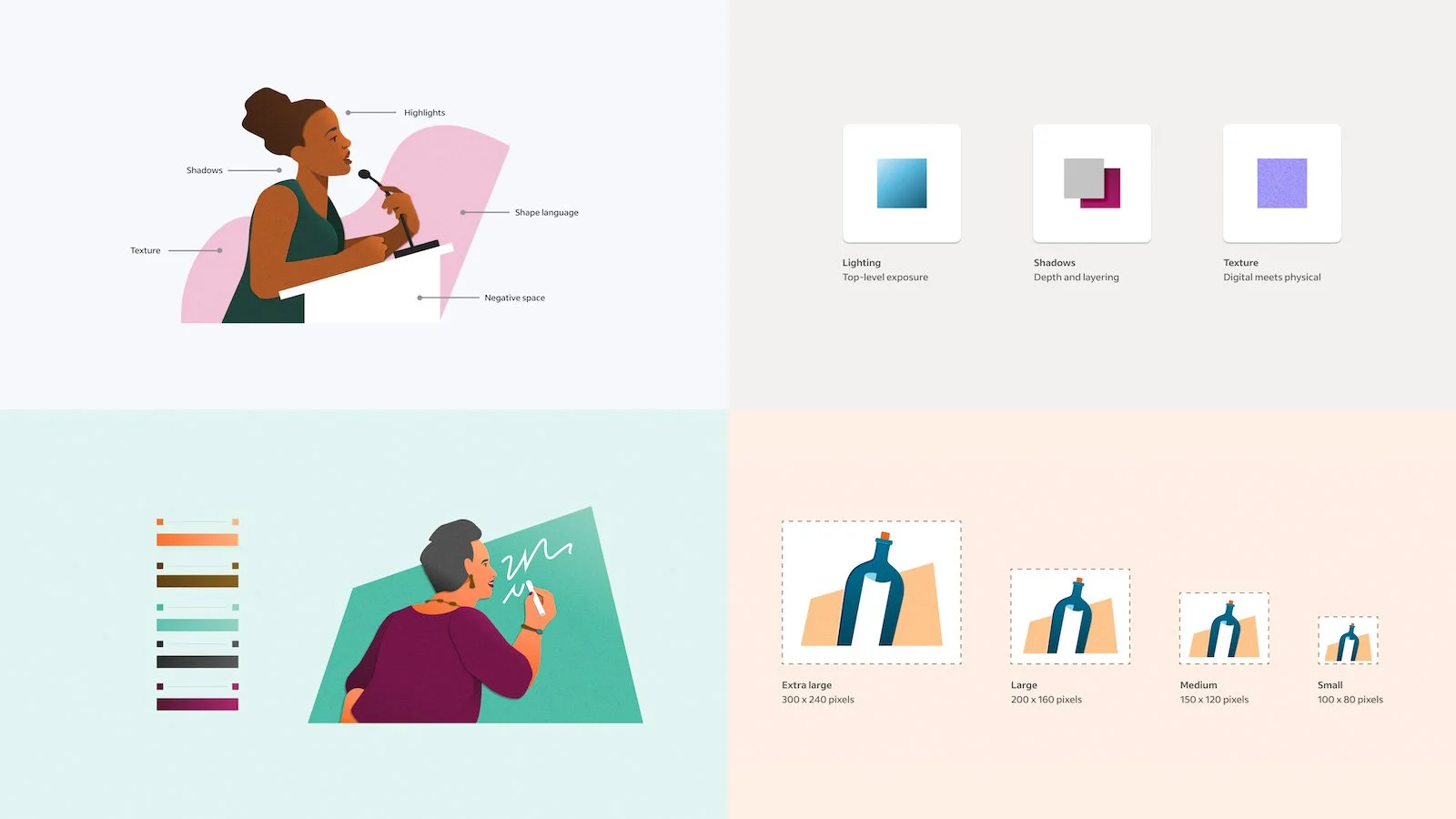
Defined a distinctive brand color palette
Transformed and matured Indeed’s color palette to reflect its growth into the world’s number one job search engine.
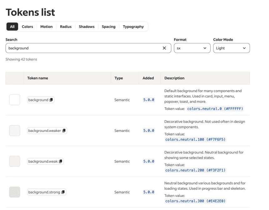
Implemented semantic design tokens
Gradual rollout: Started with colors
Dual support period: Kept both primitive and semantic tokens active during migration
Component updates: Updated design system components first to model the pattern
Documentation: Show before/after examples, explain when to use each semantic token
Linting rules: Added automated checks that flag primitive token usage in new code
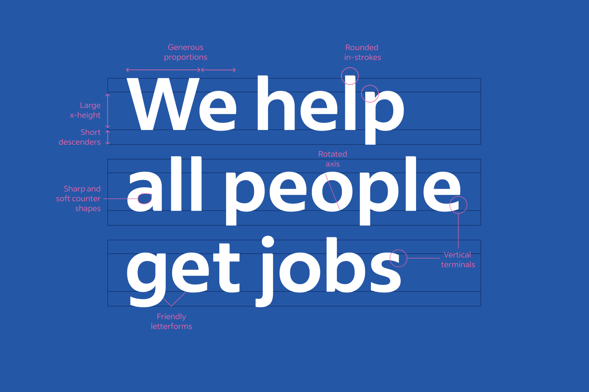
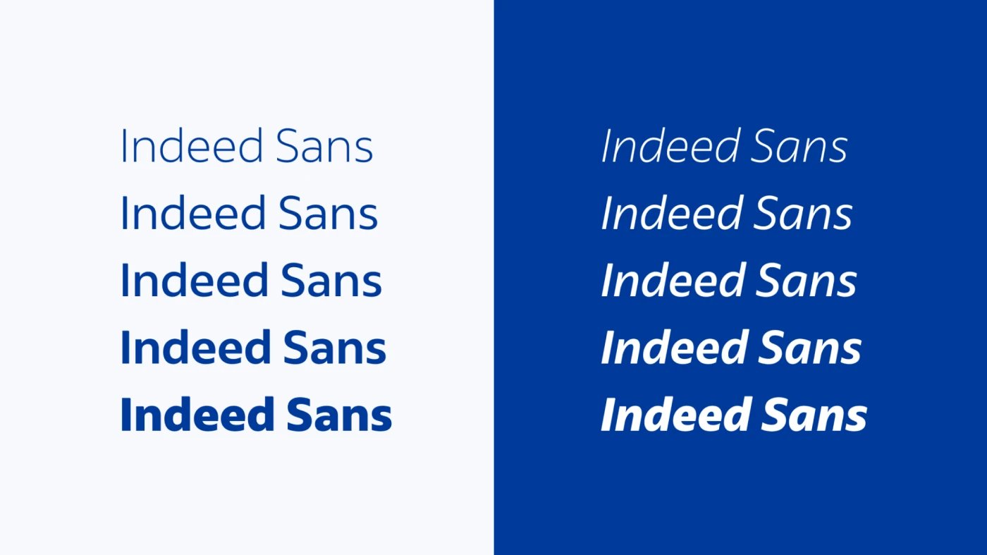
Scaled Indeed Sans
Replaced Indeed's fragmented typography with Indeed Sans, a custom variable font that unified the visual language across all products. The implementation improved page load performance and reinforced the brand's human, trustworthy voice.
Designed a characteristic illustration style
Guided team to design a scalable illustration system that brought warmth and consistency to the user experience.
Developed meticulous motion guidelines
Guided tam to create motion guidelines that transformed animations from decorative to functional, helping users understand system responses and navigate complex flows.

Curated a bespoke icon system
Oversaw the creation of a unified icon system that improved navigation, reinforced meaning, and scaled consistently across the platform.
CONTRIBUTIONS
Cross-department coordination
Facilitated design sprints with product, UX, and engineering stakeholders to align on brand direction and translate high-level vision into implementable design systems.
Implementation & validation
Led the deployment of monthly minor versions and annual major versions of the design system across product UIs, coordinating extensive user testing to validate the design decisions, and providing brand design support for uplifting deprecated patterns and UI.
Team growth and development
By establishing clear career milestones and providing ongoing coaching, I cultivated a high-performing, motivated team that was instrumental in driving the project’s success.
CONCLUSION
By 2025, Indeed’s R&D teams were fully utilizing the design system, which had become the definitive source of truth for UI and brand design, accelerating product development and reducing time-to-market.
What I would do differently today
While we hit 94% adoption, our 'contribution' speed is still slower than I’d like. If I were starting today, I would have invested in a 'Low-Code' bridge between Figma and React earlier to reduce the handoff friction.